

Map: Lucify
What function do migration maps serve in European media? Who decides what colors, what fonts and arrows should be used in migration maps? And what stories of human suffering are not told by such data visualizations? These are some of the issues explored by Professor Paul C. Adams in a chapter of a new book published by Routledge.
The mapping of migration is often driven by anxiety regarding a process that is seen as inherently destabilizing. If bodies cannot be captured in fact, they can at least be captured symbolically, cartographically. Maps are employed, sometimes consciously and sometimes unconsciously, to bring order to an unruly situation, and each map performs a certain way of being European, Professor Adams says.
Adams, professor at the University of Texas, Austin, and a Professor II at the University of Bergen, has a special interest in cartographic data visualizations in the news. From his perspective of human geography, he adds new dimensions to the ViSmedia project´s focus on visual surveillance technologies and the need for responsible research and innovation (RRI), by addressing topics such as digital cartography and online mapping.

Professor Paul C. Adams
The new research on immigrant maps shows that European integrity and Western ideals have been challenged by the «immigrant crisis». The ambivalence and the anxiety many Europeans are dealing with, Adams argues, are directly linked to how the maps are presented in the media and the design of the maps. He points out that migration maps, like other maps, can be drawn in many different ways. His immigration map studies are nontraditional in that they step away from the default way of analyzing mapping as a technical task by reflecting on the emotions, attitudes, and motivations behind map creation and map use.
This way of analyzing maps makes it possible to study them from a psychological perspective, and to determine how the maps subconsciously affect their viewers. While researching a wide variety of migration maps published in European news media, Adams found that collectively these maps serve a function that goes far beyond providing information. He exemplifies these tendencies through in-depth analyses of eight mapping cases.
The Lucify interactiv migration map bellow, is one of the cases Adams has analyzied in his studies. The Lucify map shows the flow of migration to Europe and has been frequently used in media. Adams argues that the dynamism of the image forms a striking image of movement into Europe, resonating with anxiety about invasion. However, the interactivity of the graphics (the Sankey diagram and the soccer field diagram) leaves plenty of room for interpretations more sympathetic to the immigrants.
An astonishingly high percentage of immigration maps are provided by Frontex, which acts as a clearinghouse for data about immigration in Europe. As such, Adams emphasizes, the agency has a major influence of the cartographic presentation of immigration to Europe.
– Europeans want to maintain territorial integrity but also want their country (or region) to act with integrity in the international arena. The tension between the implications of these two objectives can lead to cognitive dissonance, and maps are sought as a way of strengthening one side or the other, which tips the scale in favor of stronger borders or greater hospitality.
Adams´ chapter “Migration maps and the performance of Europeanness” examines news media’s tendency to use special types of immigrant maps to explain the current refugee situation in Europe. The chapter also discusses how the maps might affect the public psychologically. The title of the book is Migrants, Refugees and the Media - The New Reality of Open Societies, which was edited by Sai Felicia Krishna-Hensel and published in August 2018.

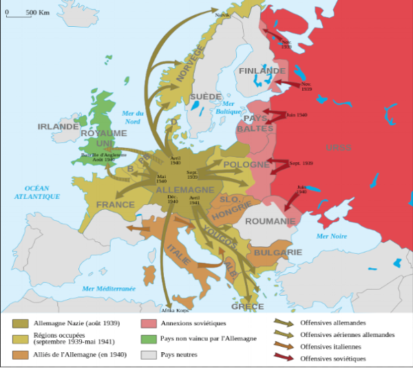
Fig 1: Frontex map Fig 2: World war II map
The map in Fig 1 was created by Frontex, the European border and coast guard agency. The design of the map has clear similarities to the map in Fig 2, in colors as well as in the overall design. This map explains the German forces advances in Europe in the years 1939-1941.
Adams argues that the resemblance of these two maps can unconsciously affect the viewer’s psychological state and cause anxiety in the public for a new invasion of Europe. As a consequence it might lead to a higher demand for a more rigorous border control and a more right-wing and conservative political environment across Europe.